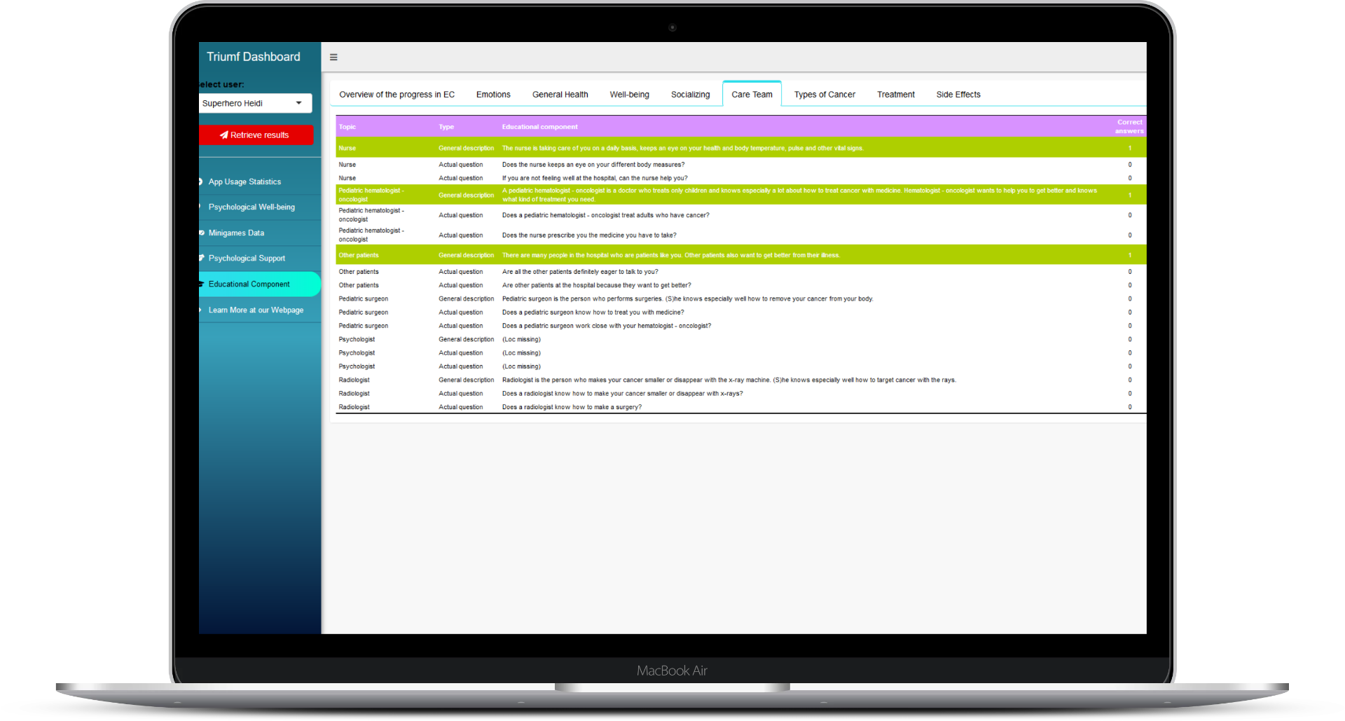
Overview of the Triumf dashboard for the care team
The status updates and news that we have shared during the last 12 months of our journey have mainly been focused on the Triumf game for pediatric patients itself. And it's for a reason! Metaphorically speaking, since the culmination of last year's initial clinical trials, Triumf's hero has gotten prettier (see Leandro's blog post about the overhaul of game's design), wittier (see Kaari's post about new content) and even more social (see Kaari's posts about the mid-year recap).
Dashboard for doctors
In addition to providing patients with theory-based support and disease-specific relevant educative material, our serious game continuously monitors the emotional state of the child through conventional questionnaire-based feedback and more interestingly also through in-game behavioural tracking. Currently, the in-game collected information is only used inside the game to adjust the psychological support content and game environment for an individual user’s needs. But our long-term goal in designing the elements of the game that are related to patient tracking has always been to make this valuable information available in real time to the care team members through easy to use dashboard interface. And now we are happy to share the first glimpses of our dashboard interface!
But before spilling the beans - we mean screenshots - few words are warranted about the logic we are trying to follow in our dashboard development process. Triumf’s design philosophy that we have followed since the very first day of our journey has been focused on developing our solution in close co-operation with our closest stakeholders, namely children, parents and clinical care teams. To be more specific, almost all the updates of the game have been based on the feedback collected from small patients and hospital personnel during the initial clinical trials.
We are committed to following the same principle also while developing the MVP of our dashboard solution. At the technical level, this commitment means the development of the inital dashboard by using R! programming environment and related Shiny application framework. From the perspective of user, the usage of "batteries-included" Shiny framework allows us to provide fully functional and secure dashboard to the initaial users for a collection of hands-on feedback, with added bonus of being quickly able to implement feedback-derived changes for further evaluation and iterative development. By really working closely with end-users, we try to develop a dashboard that passes the digital noise-level created by plethora of other e-information channels that doctors and nurses have access to.
Although secure and polished form the perspective of end-user, the R! and Shiny based solution carriers with it a limitation of of being only narrowly focused on the visualisation of the collected data. Crucial platform administration tasks such as user registration and the control of user rights that are usually carried out through the landing page of the application can't be accomplished inside the Shiny framework without compromising data security or without needing to have two different login steps while visiting the landing-page.
Therefore, our long term "master plan" is to time and resource efficiency test the Shiny based solution during the clinical trial phases while the amount of users of our app is still low enough to manually administer the dashboard related user accounts and user data-access rights. As soon as we have a working dashboard MVP that is deemed great from the perspective of end users, we will recreate the same solution based on more scalable technologies (D3.js based visualisations that are served to the user via Node.js based server that also runs the backend for landing page that incorporates user registration, authentication and data access rights management).
We are very happy to share these news with you. What do you think of our dashboard for doctors?


